
How to Choose the Best Website Color Scheme for Your Business/Brand

Visual Design Basics
Visual design can make or break the look and feel of your website. Too little color and things get drab, unexciting and hard to find. Too much color gets messy, confusing and generally unappealing. So, how do you strike that perfect balance of color use? Here is a guide for making your website pop with the right color scheme:
1. Color Emotion
Finding the right colors can sometimes be a daunting process, I totally get it, but it can also be really fun and rewarding! This process is also very easy to overthink. From personal experience, I went between a few color options in one year because I was stuck on my site looking a certain way regarding color- even when that way wasn’t what was best for my brand and audience. Here is something you may not expect… DITCH THE IDEA OF USING YOUR FAVORITE COLOR. Your brand needs to say something specific and this may not fit in with that bright neon purple you are dying to use. Without getting into TOO much detail, we want to look at this from a marketing standpoint. A ton of research has gone into color theory and what particular colors will make a user feel. You want your users to feel a particular way about your brand, so color is one of the best ways to evoke that emotion. The Color Emotion Guide below shows common colors used and what emotions are associated with them.

Pretty cool, right? So this is why it’s so important to ditch that favorite color you have to use (unless it actually aligns with your brand’s vibe).
Here’s what you can do: Write down some keywords about your business or brand. What do you want your brand to tell people? Are you trustworthy, bold, friendly, creative, warm? Then look at the Color Emotion Guide and see what is aligning to what your brand is saying. Then run with that color as your main color and don’t look back!
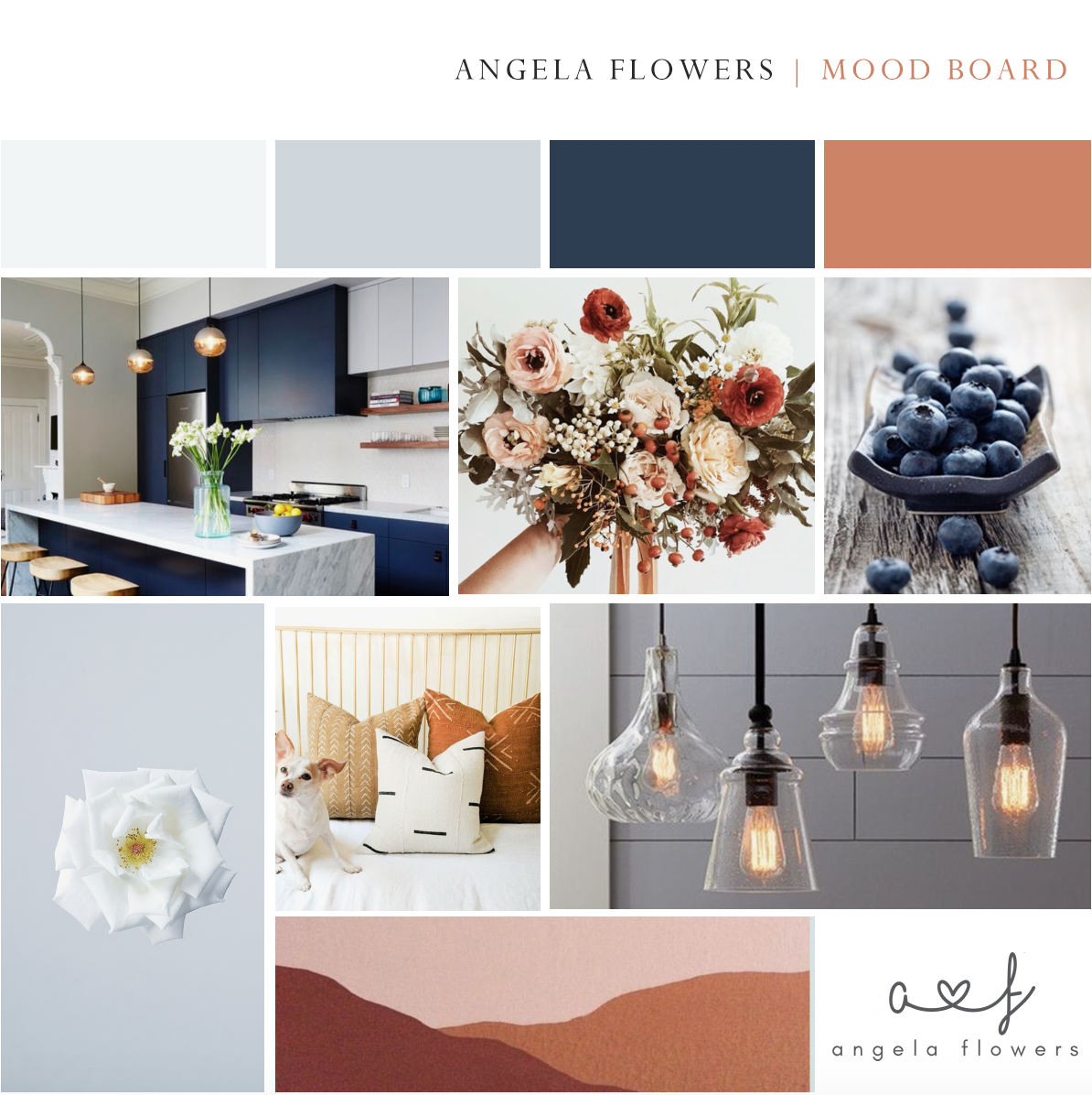
I had my heart set on using green tones on my site. It just wasn’t working for my web design business. Peaceful and healthy didn’t exactly say friendly, confident, creative, or trustworthy. These were some of my keywords, which mostly fall into the orange category! Other keywords that I discovered for my business aligned with the color blue. So, the main tones of my site are a rust, cream, beige tone with light blue accents here and there! Orange and blue, voila!
2. Color Schemes
It’s important to know some general color concepts so you’ll be prepared to create the mood, tones and styles that you want. Here are some main color schemes:
Monochromatic— similar colors all in the same hue or shade.

Source- Adobe Color Wheel
Analogous— 3 hues that are next to each other on the color wheel- like green, yellow, orange.

Source- Adobe Color Wheel
Complimentary— 2 hues that are opposite of each other on the color wheel.

Source- Adobe Color Wheel
Triadic— 3 colors that are all equal distance from each other on the color wheel.

Source- Adobe Color Wheel
3. Color Tools & Resources
There are many tools available to help you with color schemes and combinations. Here are some good ones.
I also have to put Pinterest on this list. This is a fantastic resource for not only getting color inspiration, but also for creating boards for general look and feel inspiration and for creating mood boards.
4. Swatches & Examples
Below is an example of a mood board with color choices of an earlier version of my website. I love using different shades of a color and then one complementary pop of color.
SOME FINAL TIPS!
BEST PRACTICE- have one core color in mind for your site. Then you can play with different hues and shades and also see what color might complement this one. Always prioritize what best conveys the mood and emotions you are trying to evoke for your business and brand. Keep it simple! As a rule of thumb, if you are new to web design and color theory, it’s smart to keep your color scheme to no more than 2 colors (excluding shades of the same color).
Don’t forget that all of your visual content needs to support this color scheme- ie, images, your logo, etc.
A mood board is super important! Don’t forget to use this great tool to pull some inspiration together to find that perfect shade of that main color.
As always, I hope this was inspirational and helpful! Let me know your color scheme and comment below!
Angela